AENT 3rd Edition Pictures
Click on an image for a bigger picture
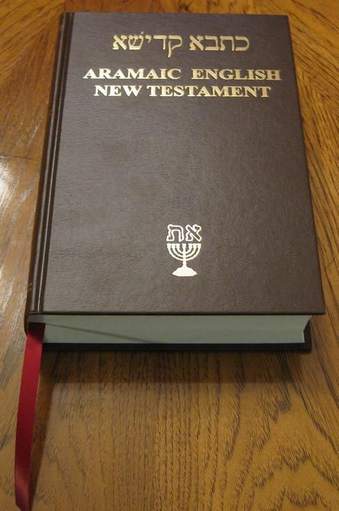
Beautiful gold lettering on the third edition with an added Menorah. Notice the long red ribbon marker. The Hebrew letters are in Aramaic and read "Set-Apart Scriptures".
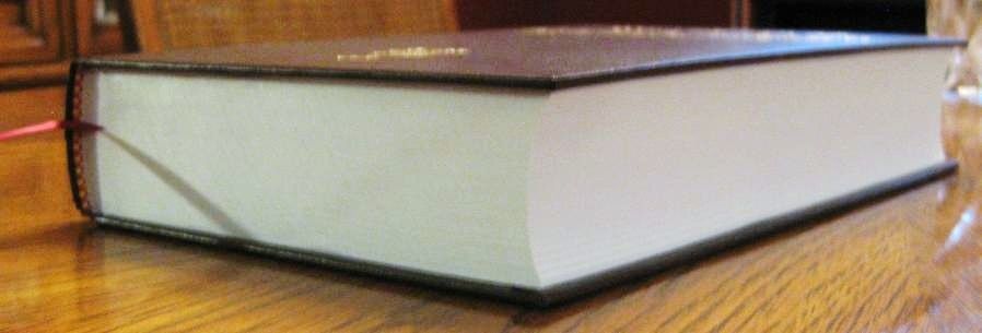
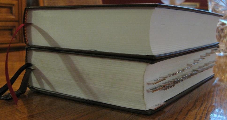
No gilded edging, but the pages are nice and tight.
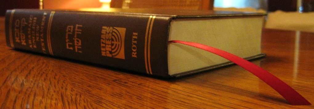
The third edition AENT has a beautiful ribbon marker that's not only longer, but singed at the end to avoid any fraying.
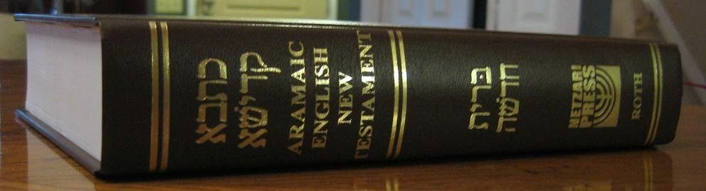
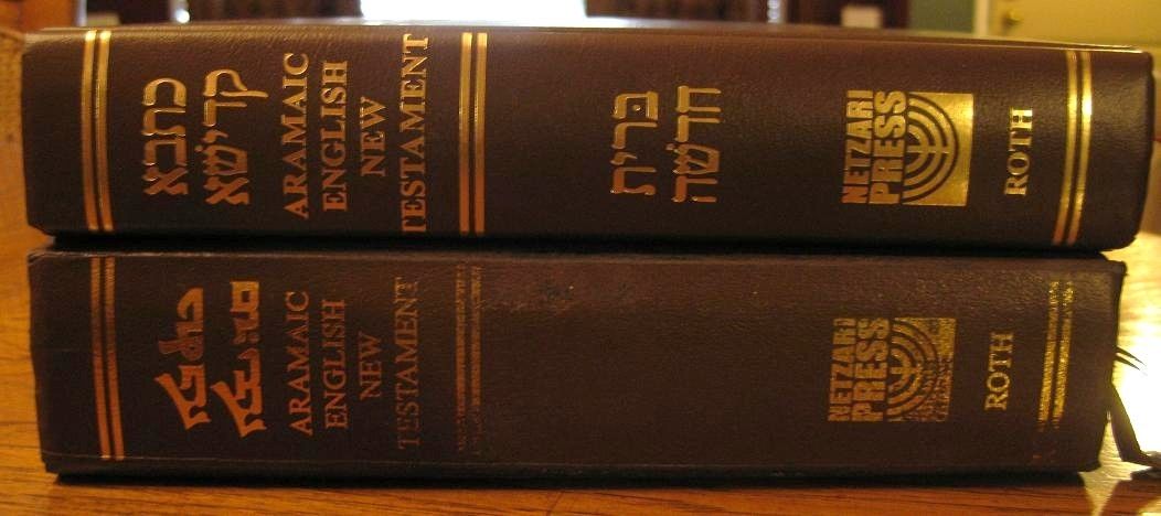
The spine is tight and has the same beautiful gold lettering. The Hebrew lettering in the middle reads "B'riyt Chadashah" (Brit Chadasha) which means Renewed Covenant.
At Matthew chapter one the book has no problem staying open. It seems a little more stiff than my first edition which opens up fully without any resistance, but since my third edition is brand new at the time of this photo this is to be expected.
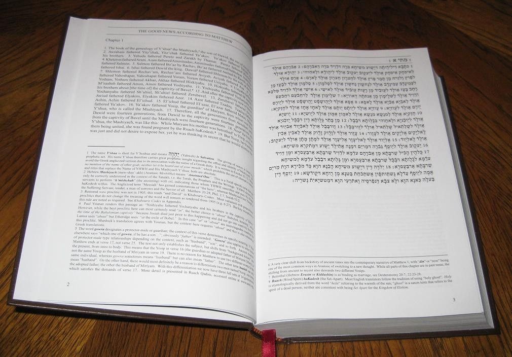
Here is a picture of it flat with the text. Notice the Aramaic is now in Hebrew lettering. The pages also stay a lot more flush in the third edition, which you will notice in some comparison shots to the first edition below.
Again, very nice binding with flush page edges.
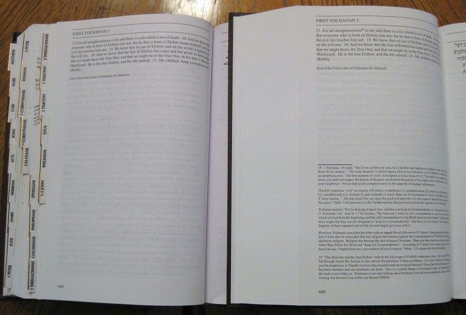
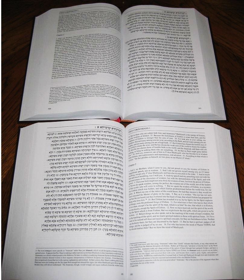
Here's a comparison shot to the first edition on the last page of 1 Yochanan 5. Notice how there are new footnotes in the third edition. If you notice on the first edition (shown on the left), there is writing in the margin on the side. That's from Galatians, several books earlier, so compared to the third edition you can see the improvements in binding where the pages are a lot more flush.
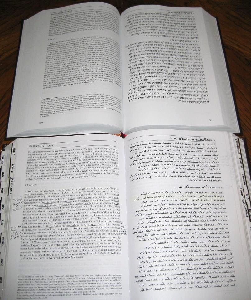
Here you can see a comparison between the Hebrew letters and Aramaic letters. Notice again the flushing of the pages between editions.
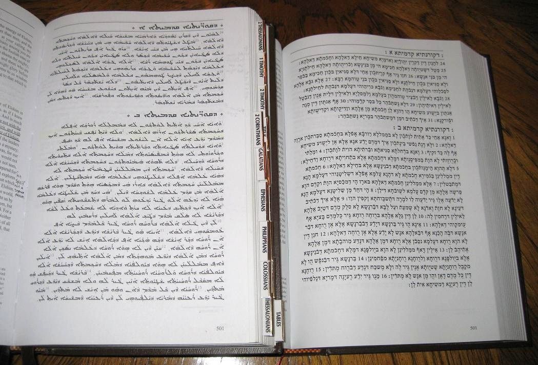
Another, this time side-by-side, shot of the Aramaic letters compared to the Hebrew letters. The text is still pure Aramaic, but if you can read Hebrew, you will be able to sound out the Aramaic and recognize many of the words and sentences since the two languages are very similar.
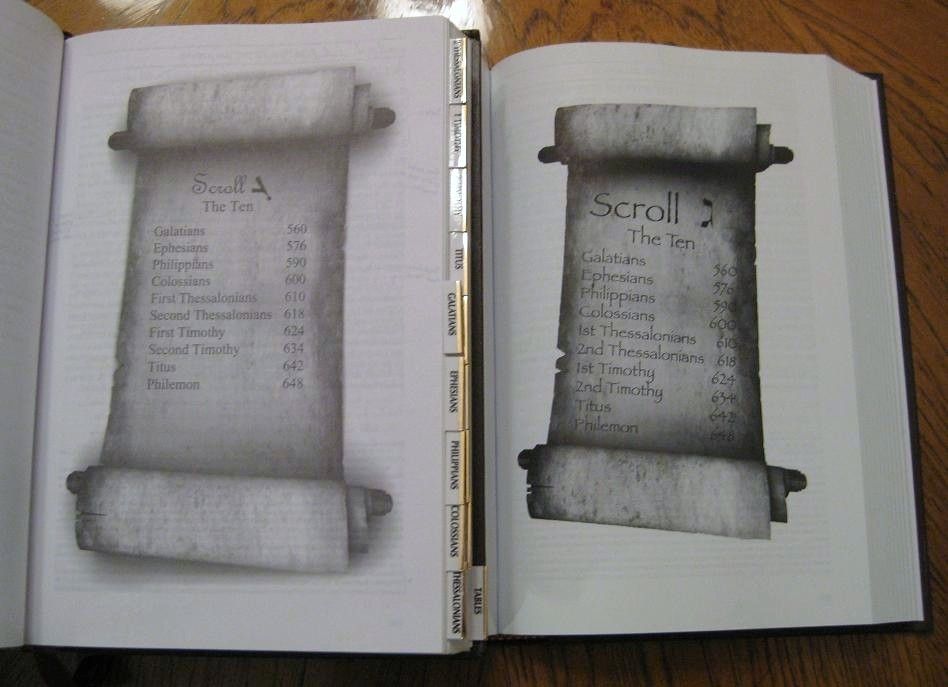
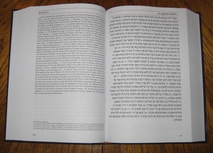
Another update in the third edition is some of the graphics as well, which you can see here. The improved print quality really shows in this photo as well!
The first run of the third edition was accidentally mispaginated where the English was on the other side of the page, and the corresponding Aramaic text was on the opposite side. This was a printing error that was corrected quickly and everyone received a new copy at no additional charge (they also received Andrew Roth's new "Wheel of Stars" book as a free gift, showing unbelievable customer service on the part of Netzari Press. Todah rabbah Baruch and Andrew!) Many have mentioned that the mispaginated version is fine though, and the remaining stock is being sold for about a third of the cost of a regular edition. I've ordered six myself to give to friends and family as gifts.
Here is a comparison of the spines from the first to the third edition. Notice the third edition is slimmer. My first edition may appear quite beat up, but it's not from poor quality or mishandling, I just use it. A lot.
Here's a another shot comparing the two editions. Notice the improved ribbon marker on the third. I also added in a couple of extra ribbon markers (as well as the index tabs) on my first edition, but the brown one that's taped on the end (my cheap anti-fray job) is the original one.
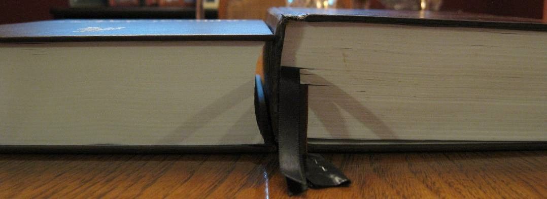
Here you can see very clear the reduced thickness on the third edition AENT.
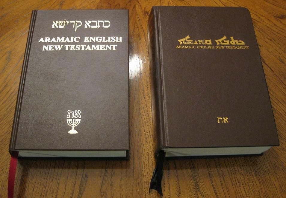
Finally, here are the covers between first and third editions. While the third edition cover is an improvement, please also note that my first edition is highly used.